_LOGO_IDENTITY
Designline
How Ginger Storm designed memorable stationery fit for memorable spaces.
DesignLine is a commercially savvy, considered design and client-focused architecture and interiors firm. The firm creates innovative, functional, and memorable spaces.
Photography
@russsmithphotography
The architectural firm DesignLine requested a rebrand of their brand identity. They wanted to create a sophisticated, modern, and edgy look,
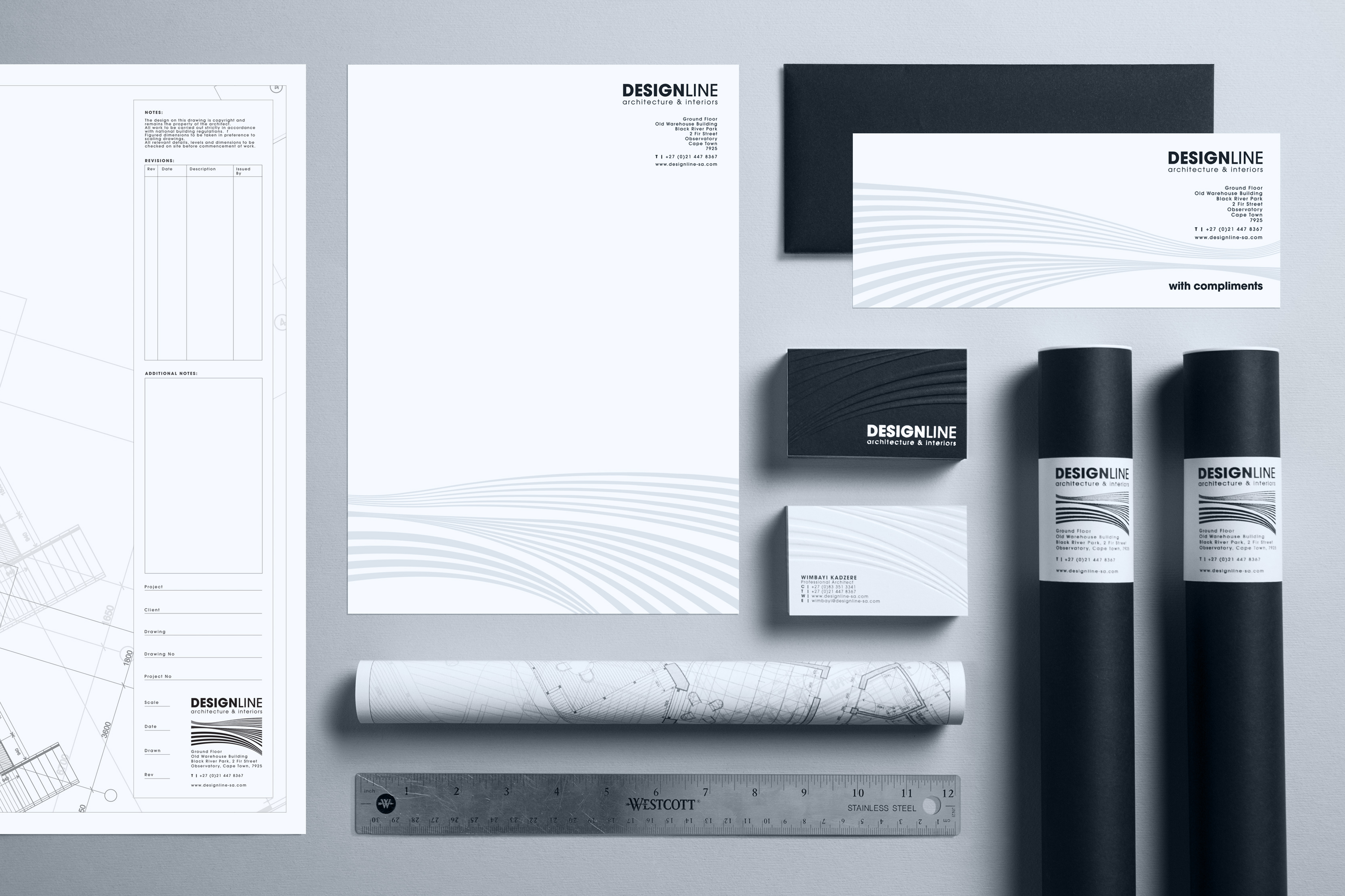
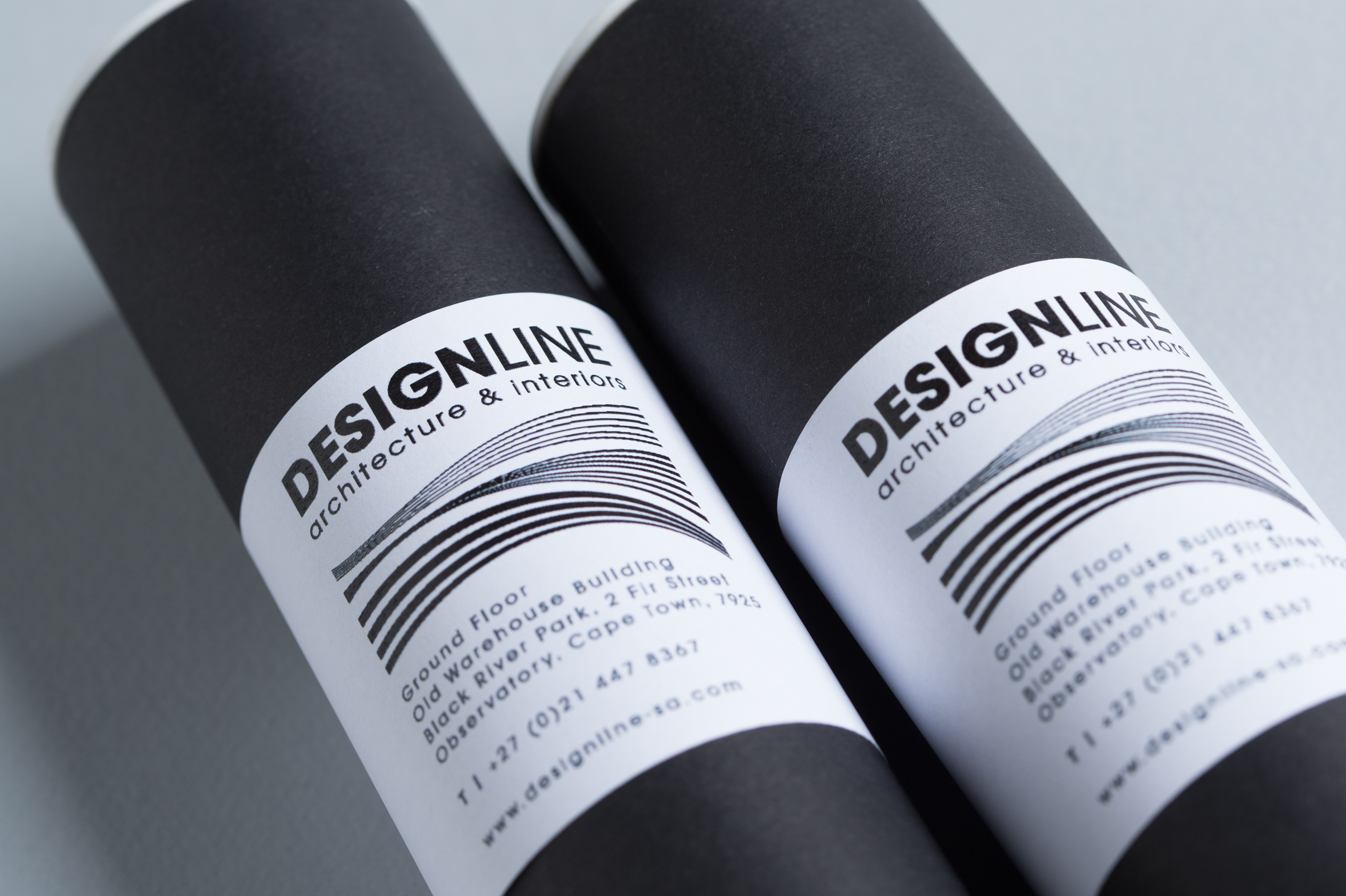
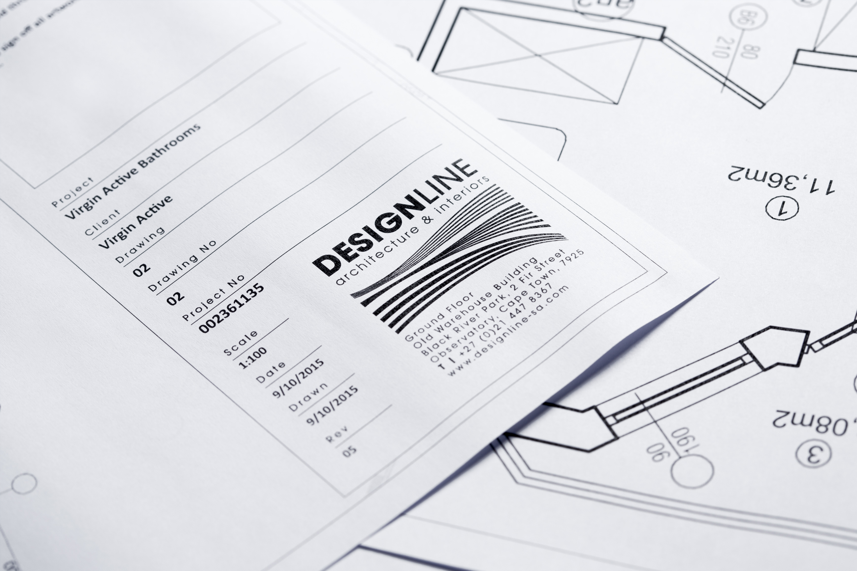
To fulfil the brief I utilised a clean typographic logo and included variations on linear line work to create a graphic icon and pattern representing the fluid, functional, layered approach to business.
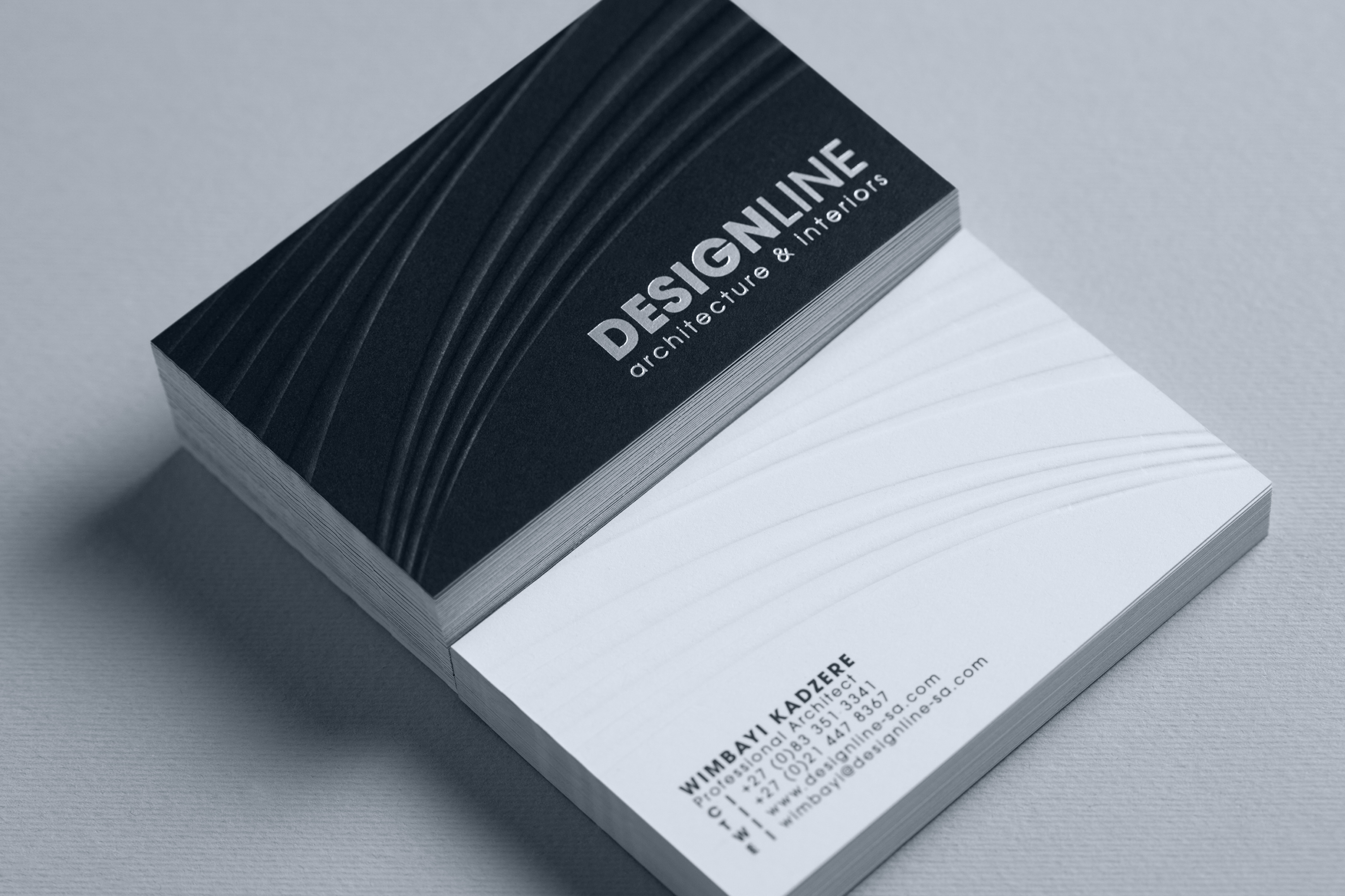
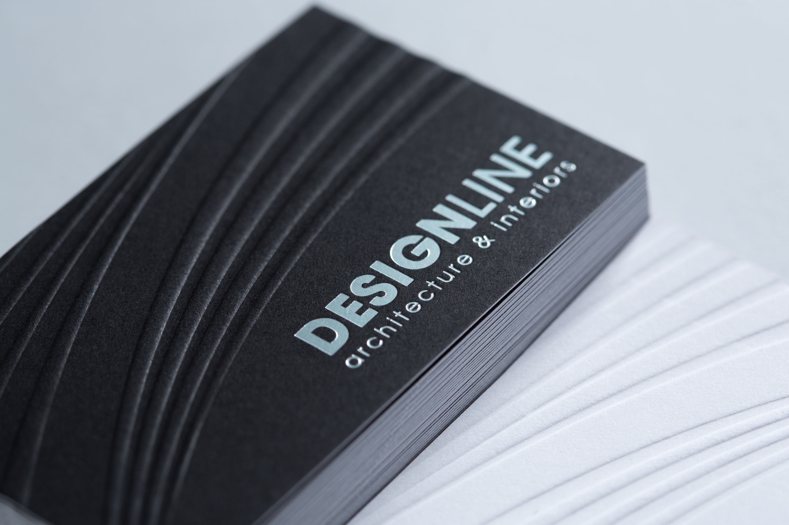
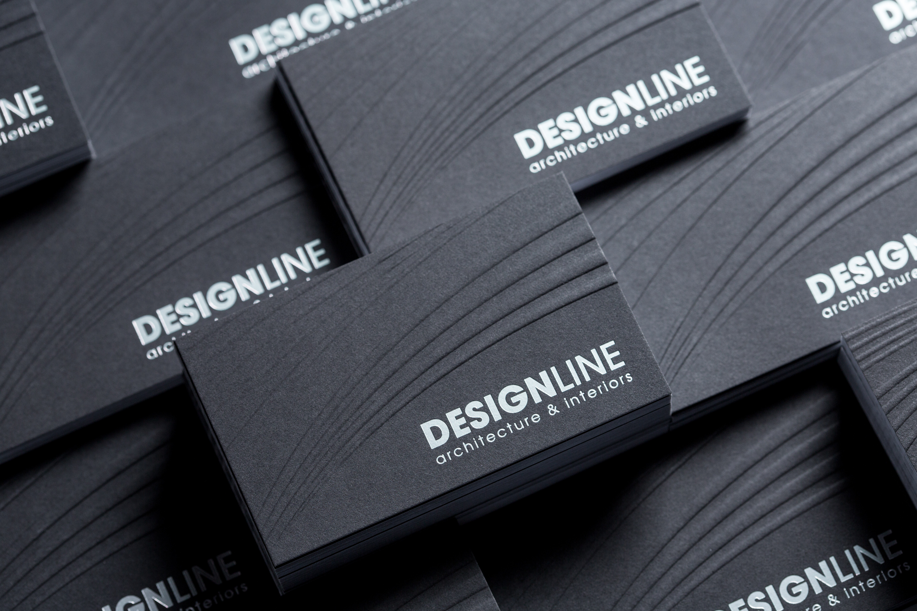
The graphic line elements that form part of the logo create a graphic pattern that carries across different stationery items. This creates a recognisable symbol and gives each item a unique personality and differentiating feature that still ties into the brand. Black business cards with silver foiling and blind embossing create a tactile, striking design.
The overall impact of the tactile and innovative stationery was strong and bold.
