_BRANDING_PACKAGING_ILLUSTRATION
Sticky Fingers Cannabis — Chasing the High
A brand smart enough to make the market look tired
The Divine Collective — a forward-thinking Cape Town start-up on a mission to bring quality, wit, and genuine craft to the South African cannabis scene. A young, ambitious team who believed the category deserved better, and had the vision to prove it.
Illustration
@studiokronk
3D Rendering
@MF3D
The South African cannabis market had a problem: shelf after shelf of tired graphics, weed-leaf clichés, and childlike cartoon aesthetics— brands that simply didn't endure the intelligence of their adult audience. The Divine Collective wanted something smarter — a premium product that could hold its own locally and internationally, built for the discerning consumer who brings both taste and a sense of humour to the table.
Ginger Storm took full ownership of the creative brand response — approaching the brief holistically and asking a single question: what would it look like to genuinely redefine this category — edgy, fun, and sharp enough to actually make adults laugh?
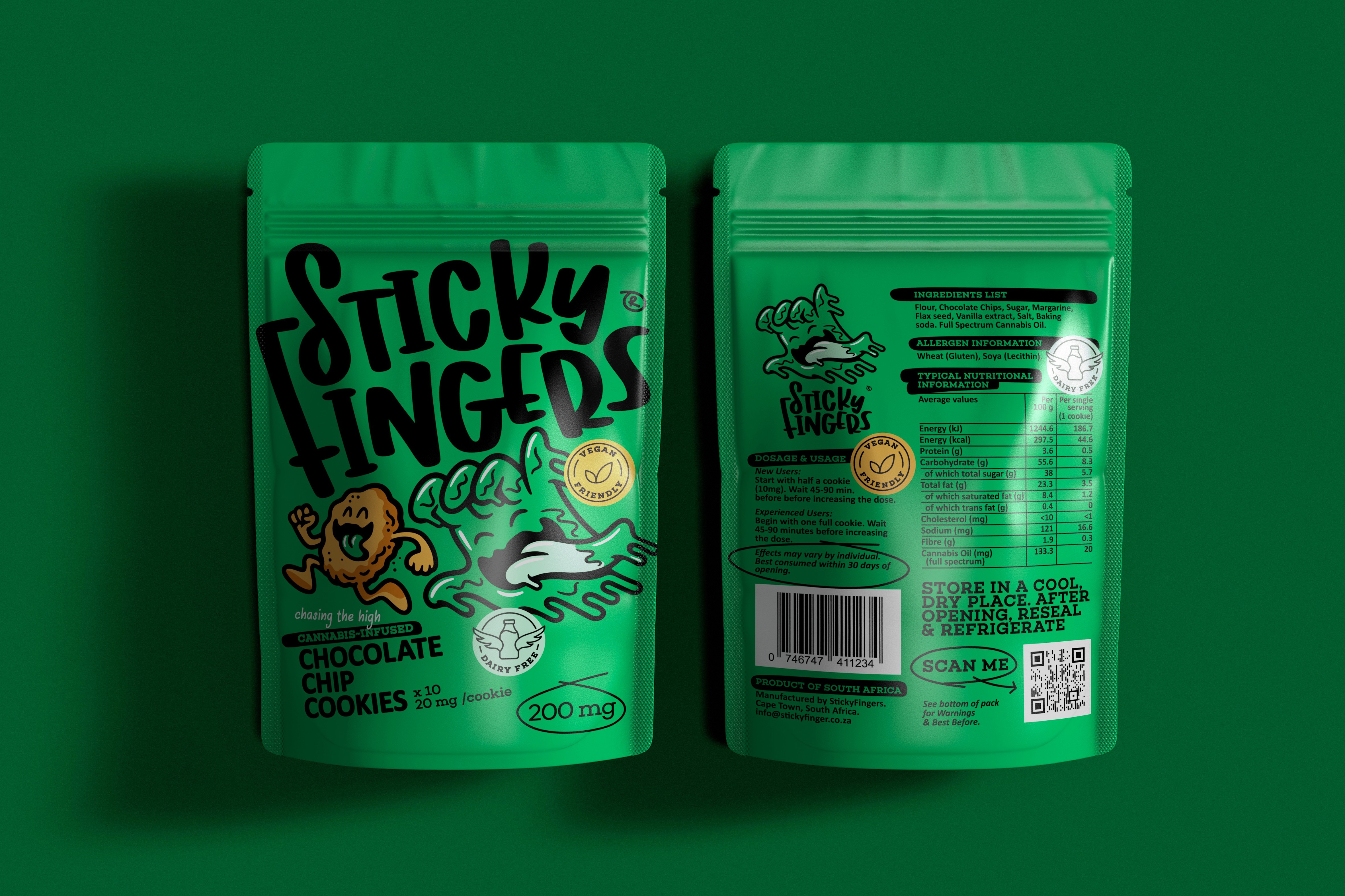
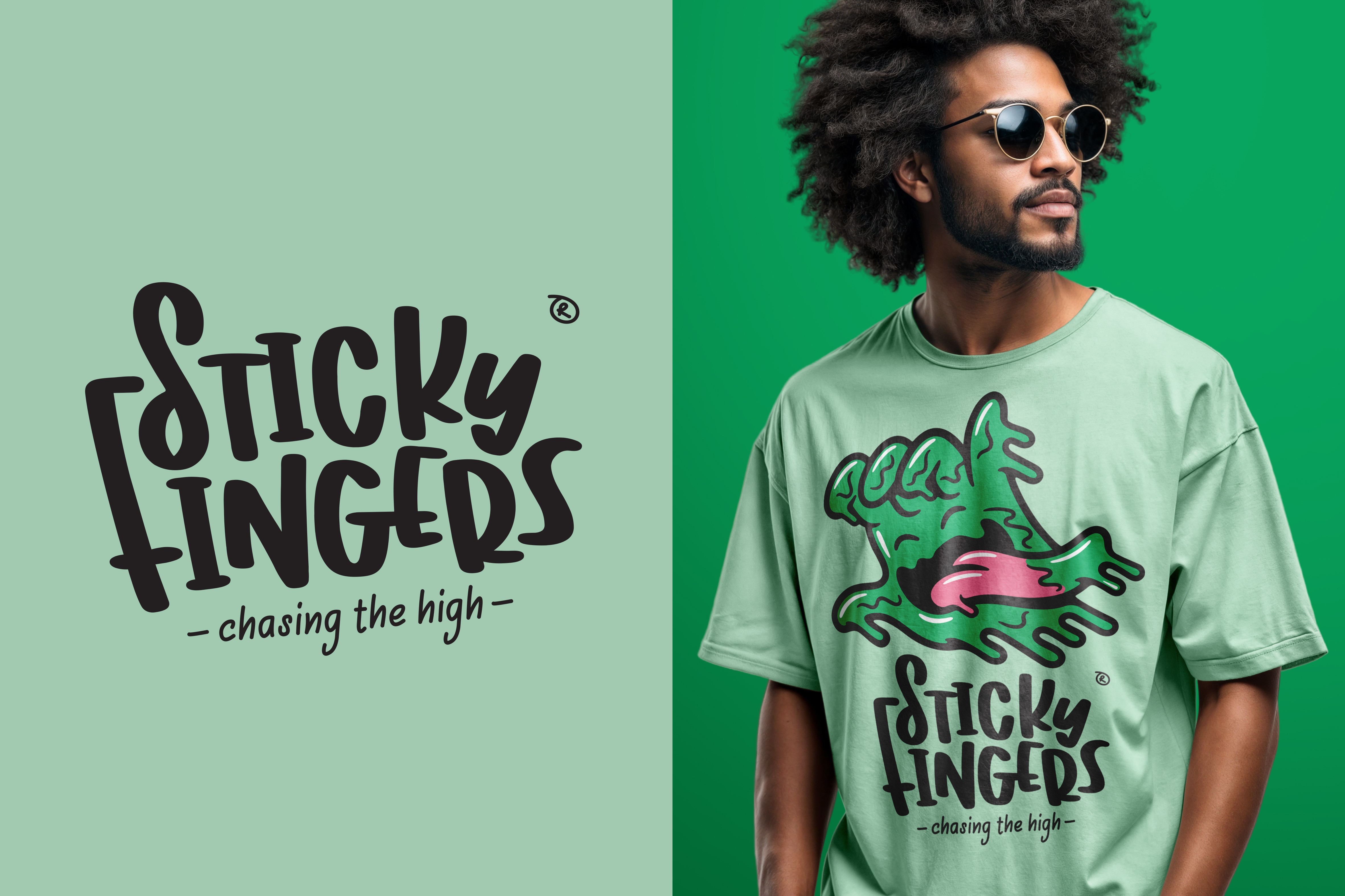
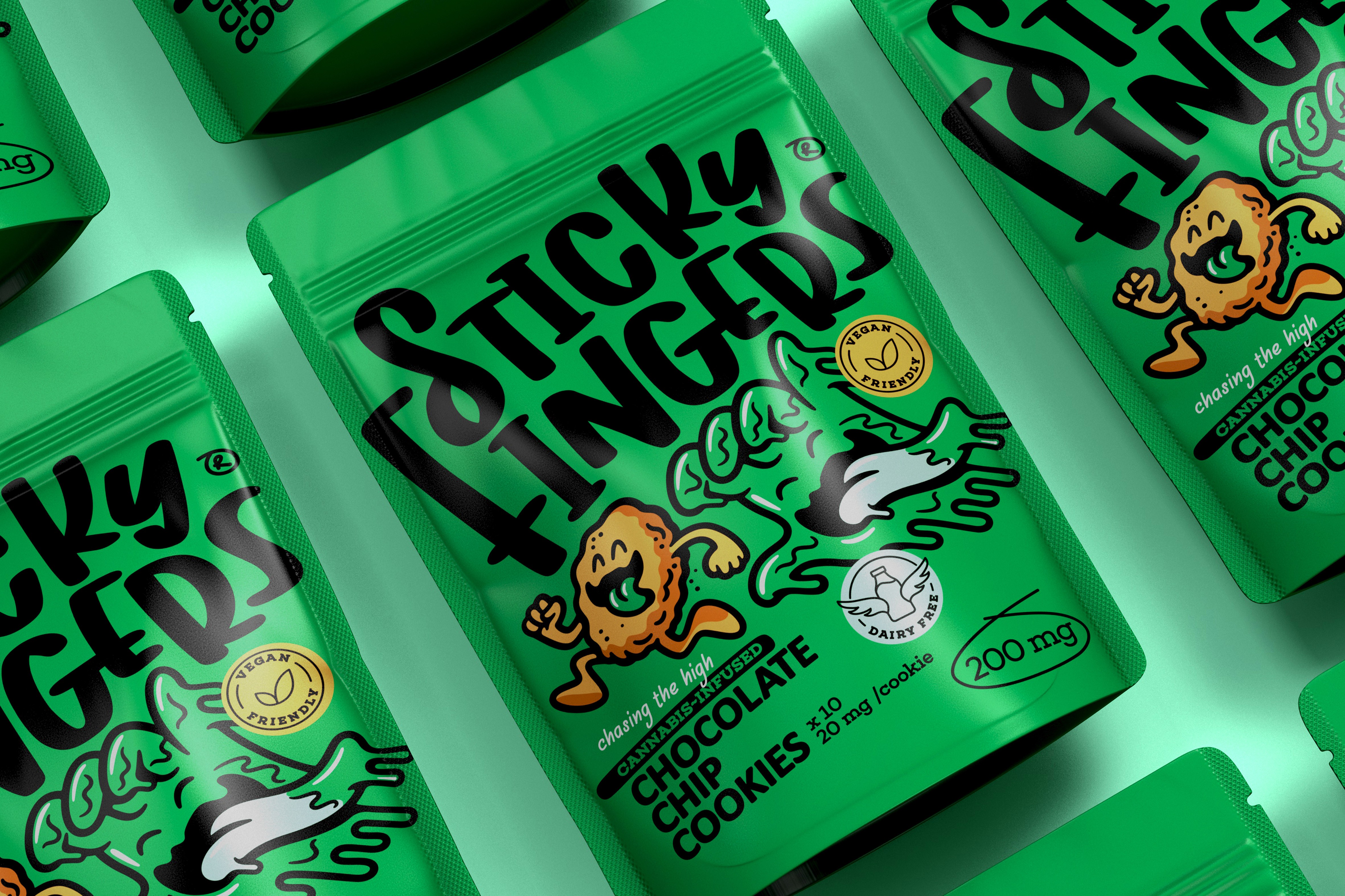
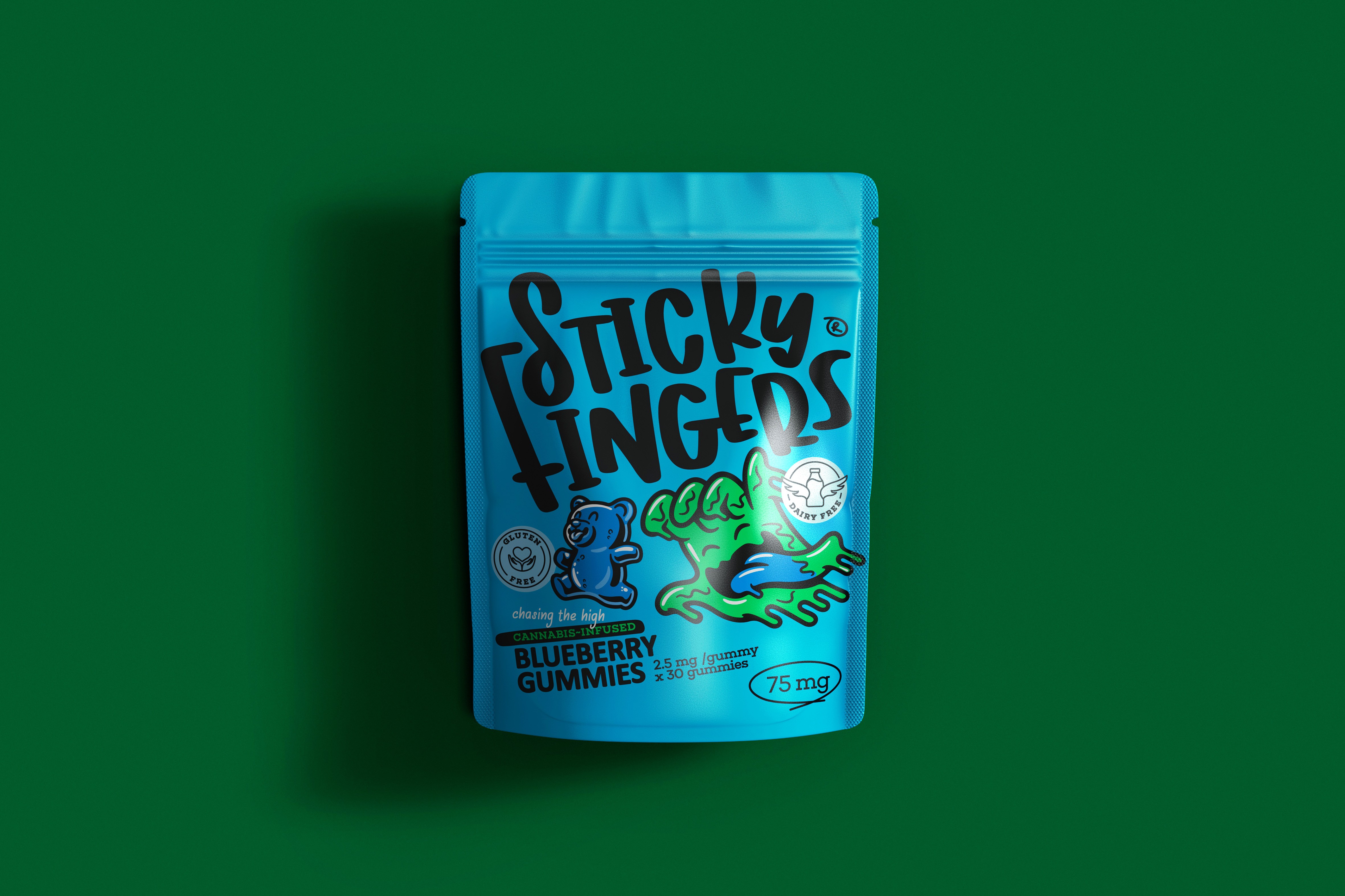
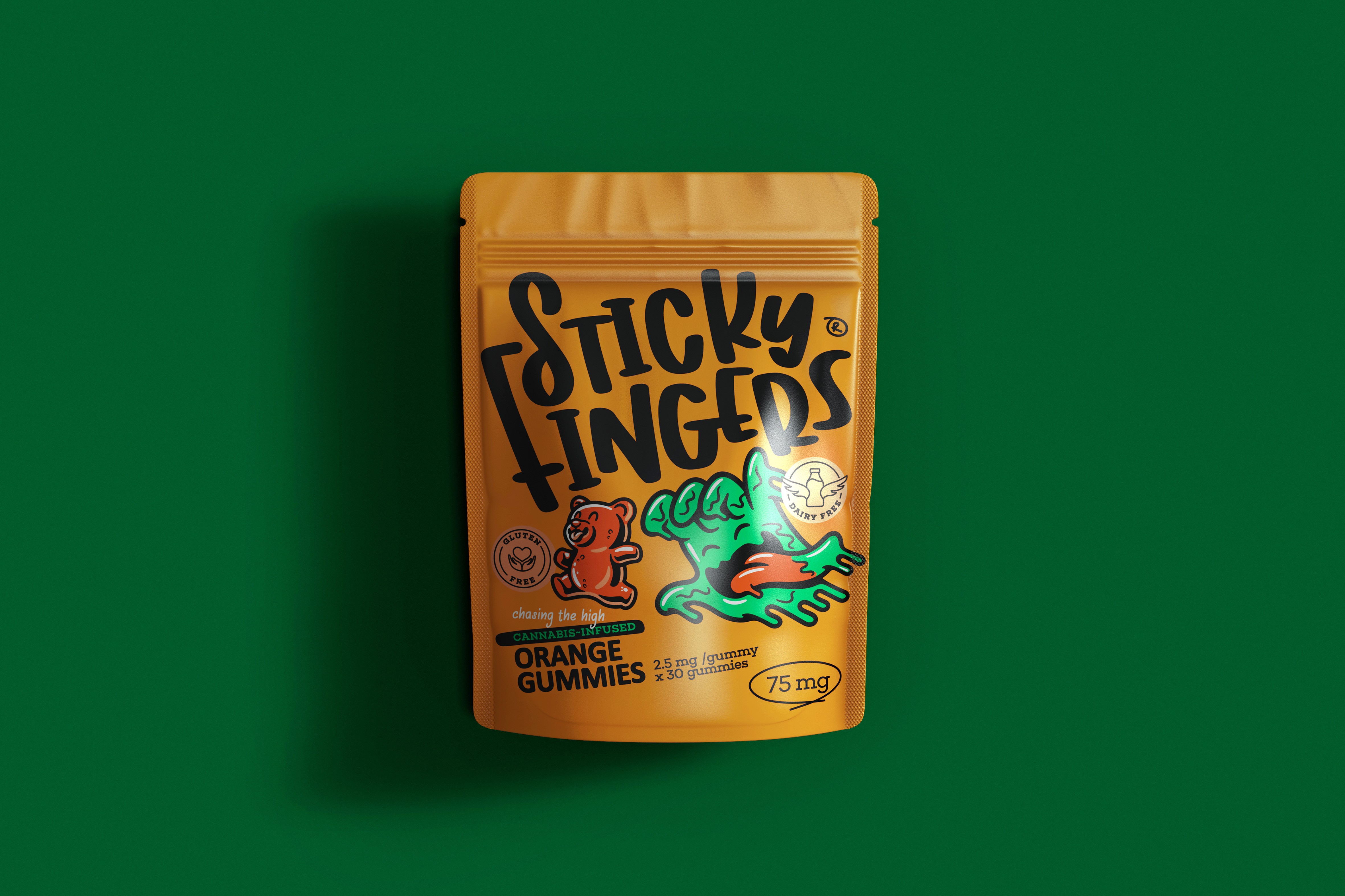
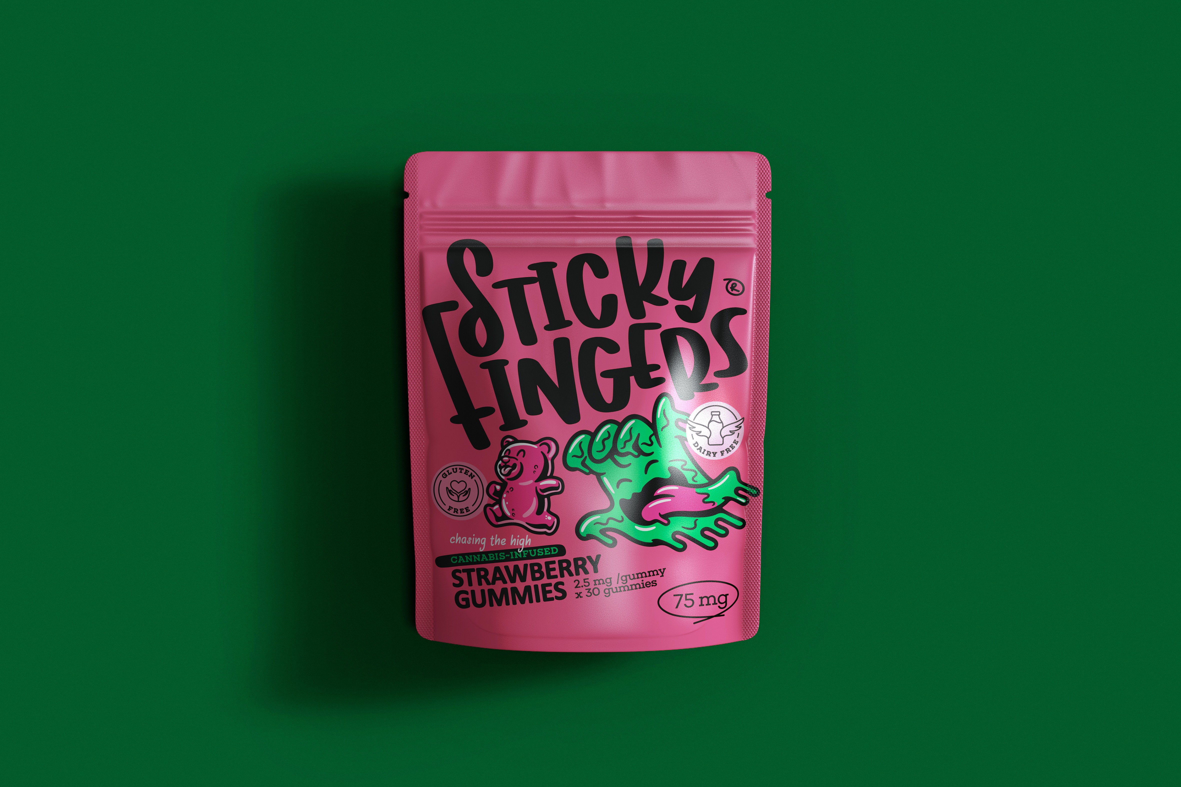
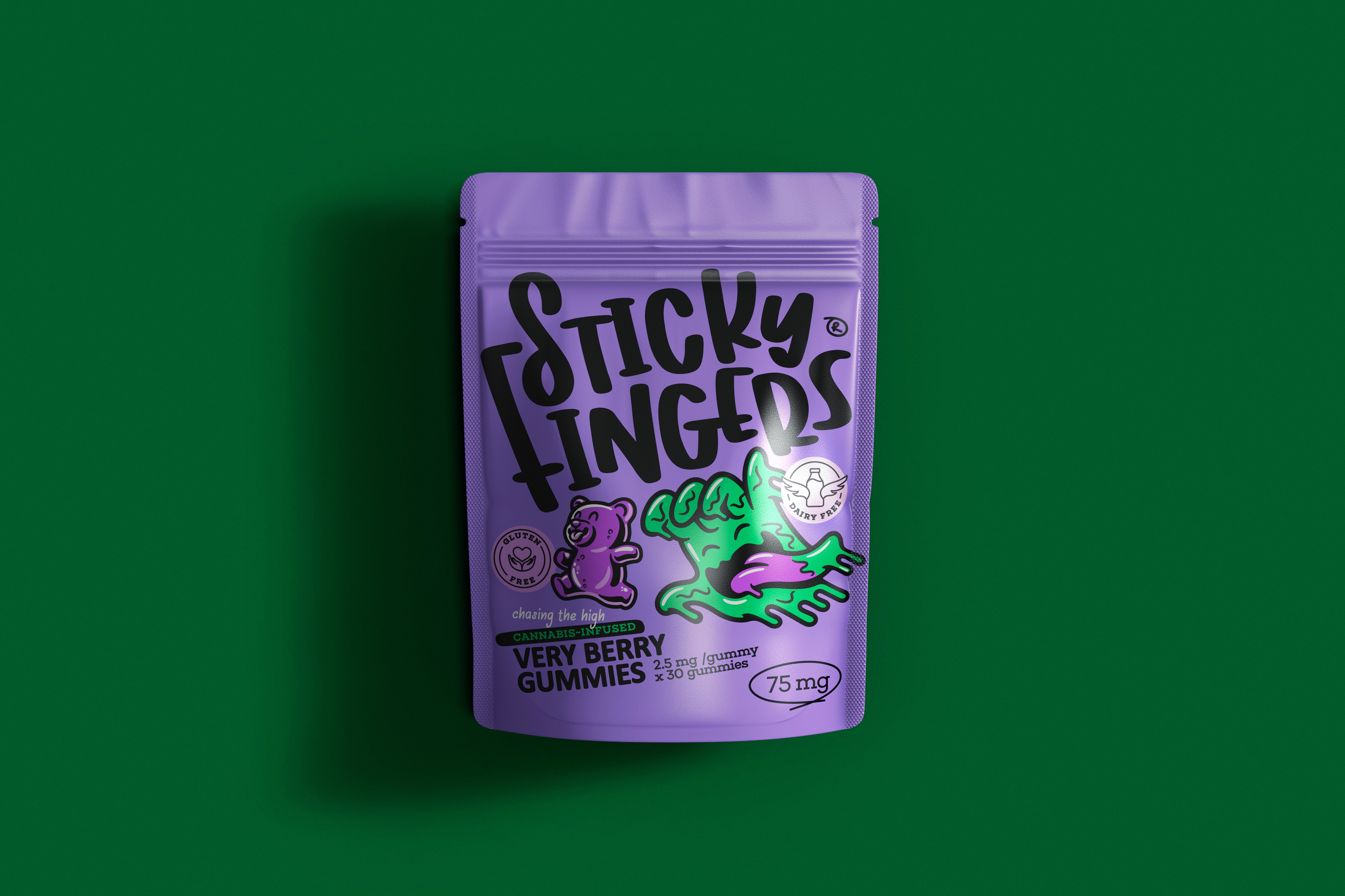
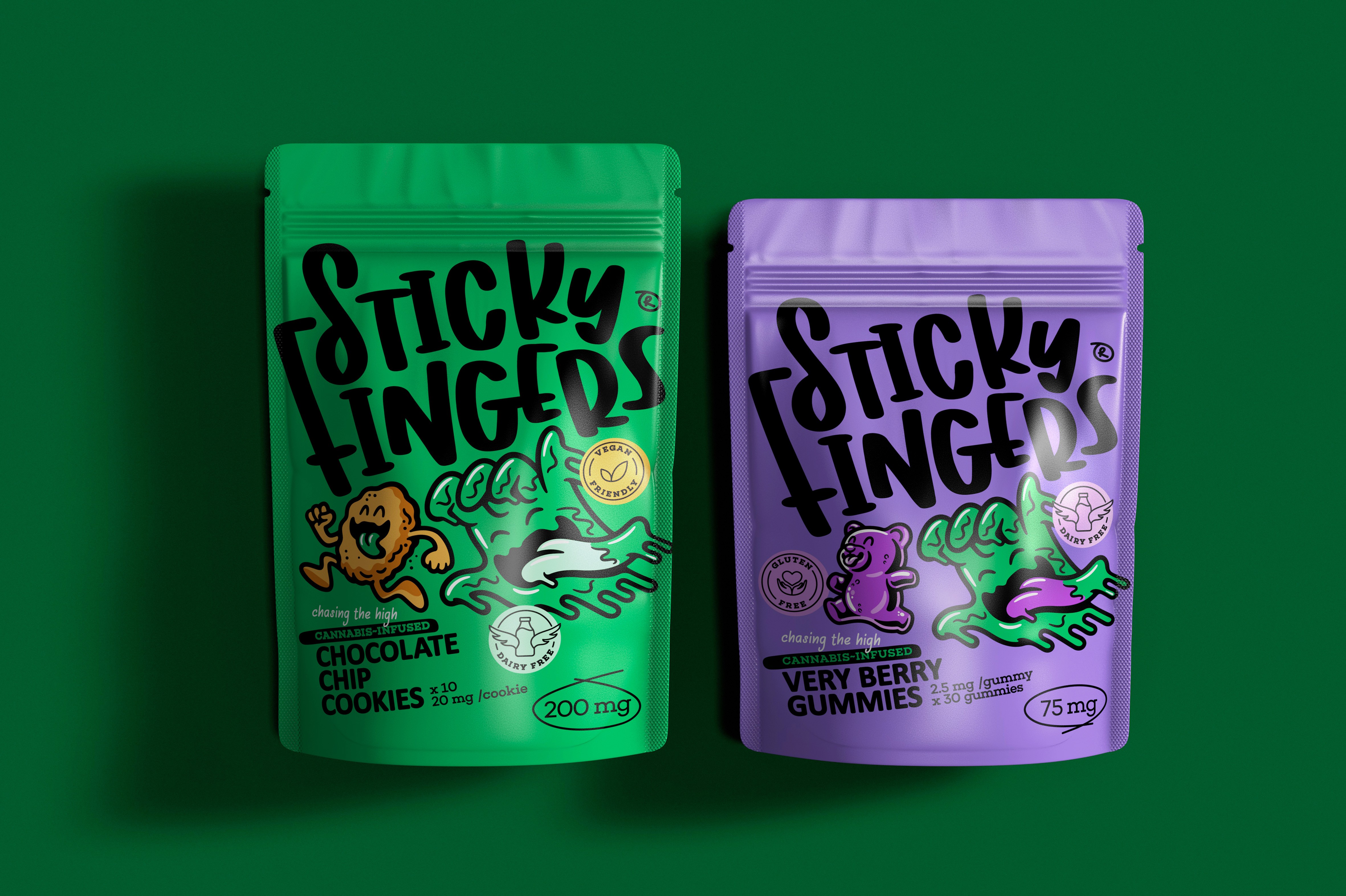
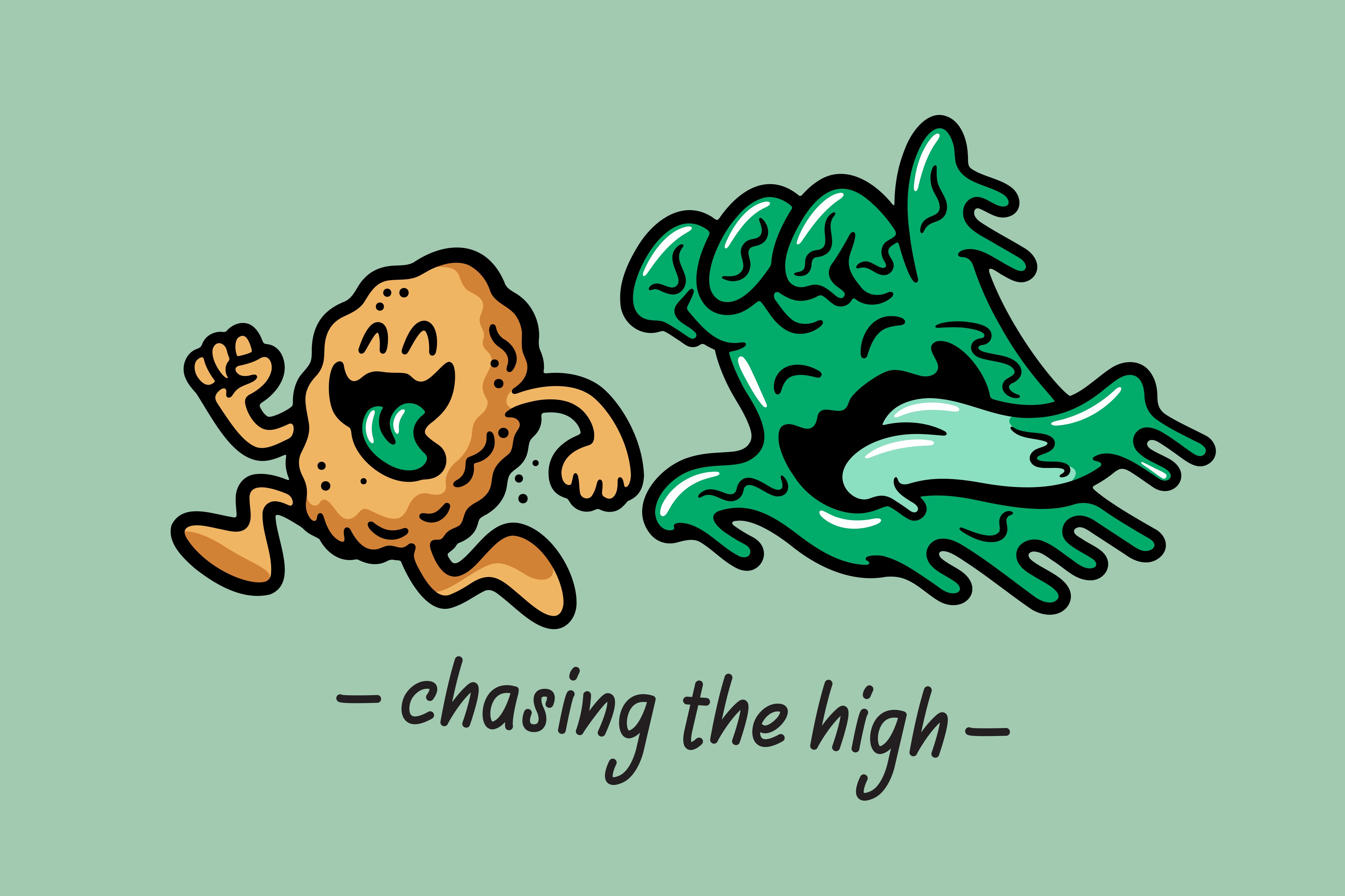
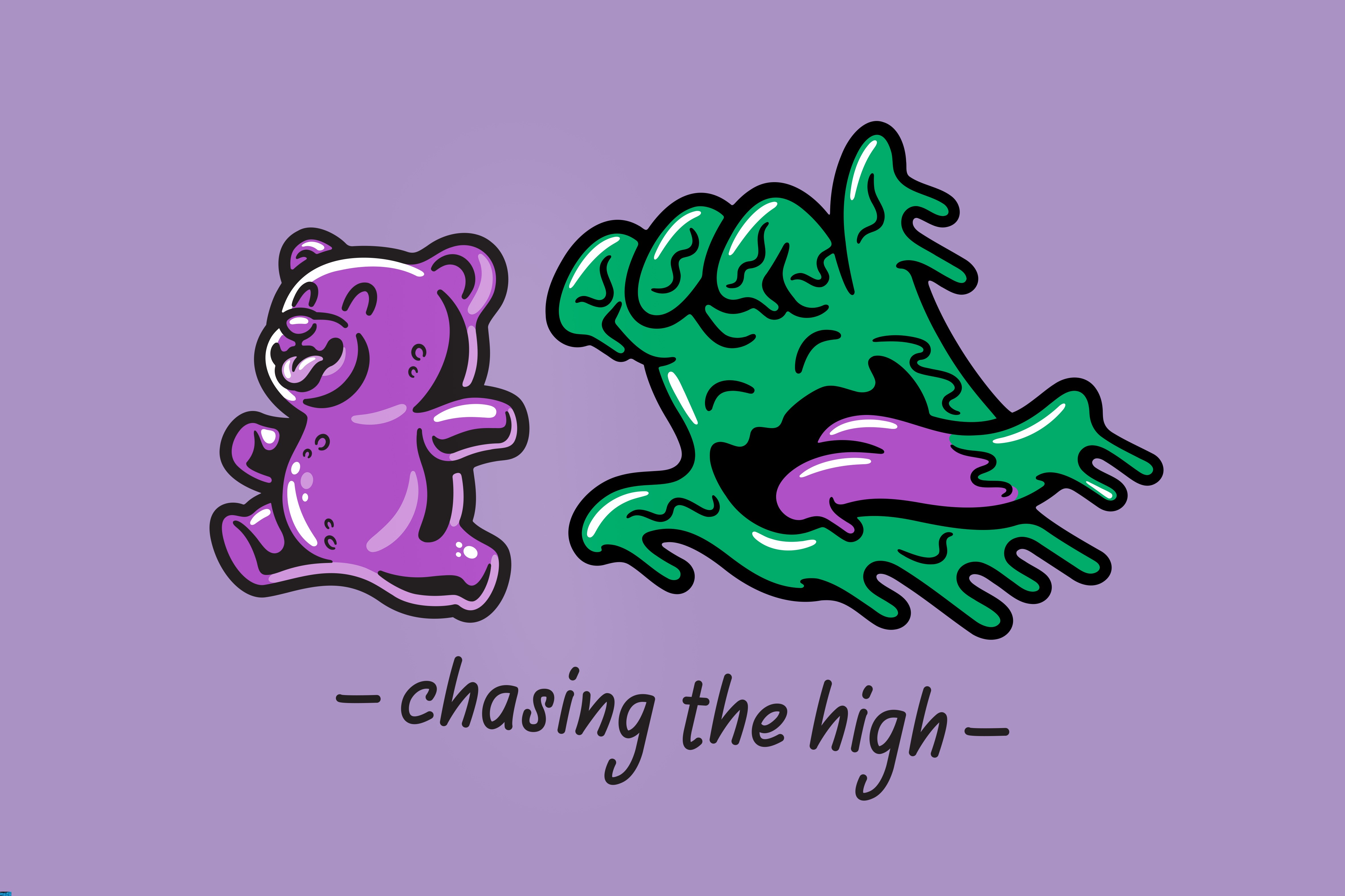
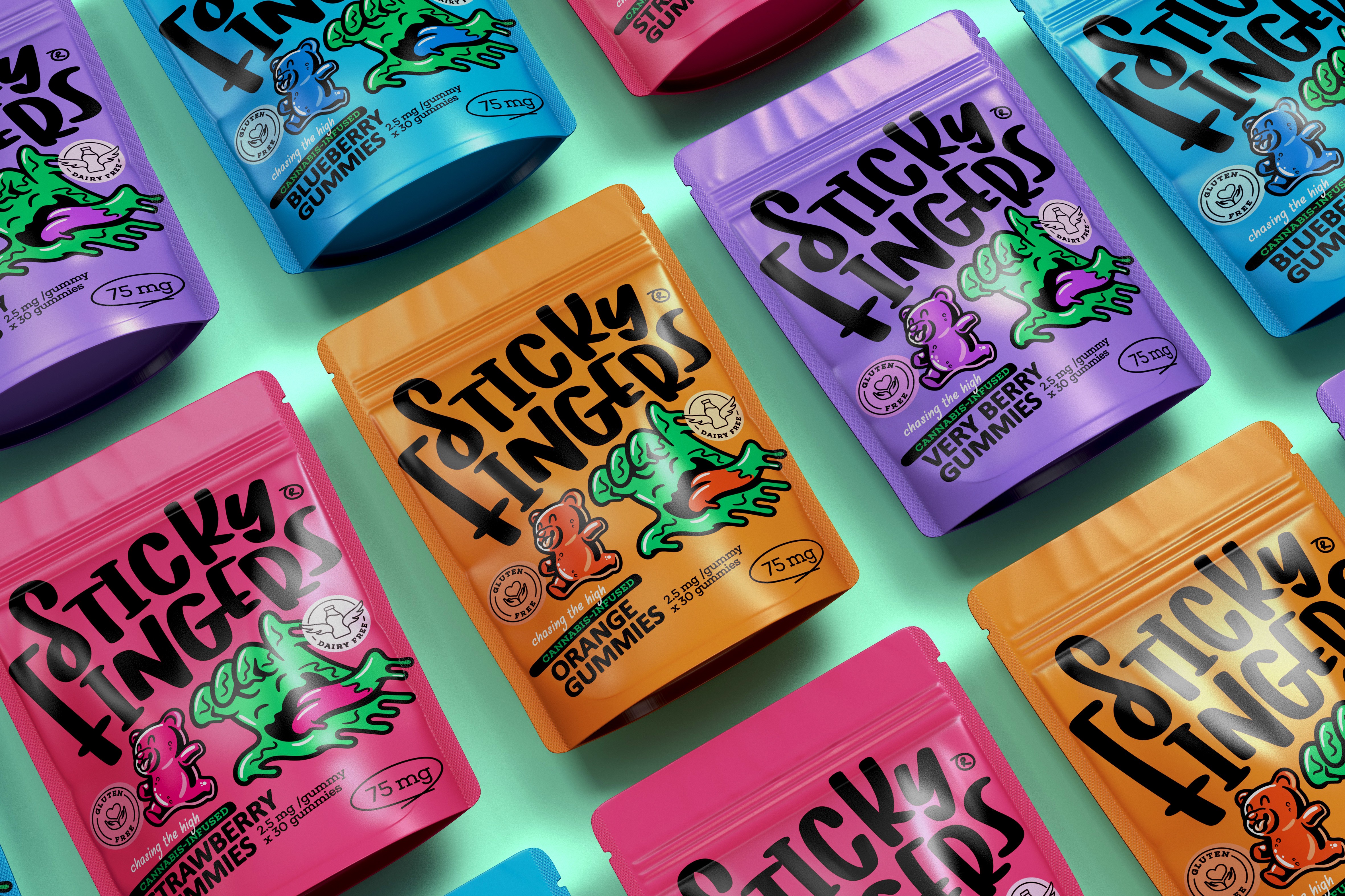
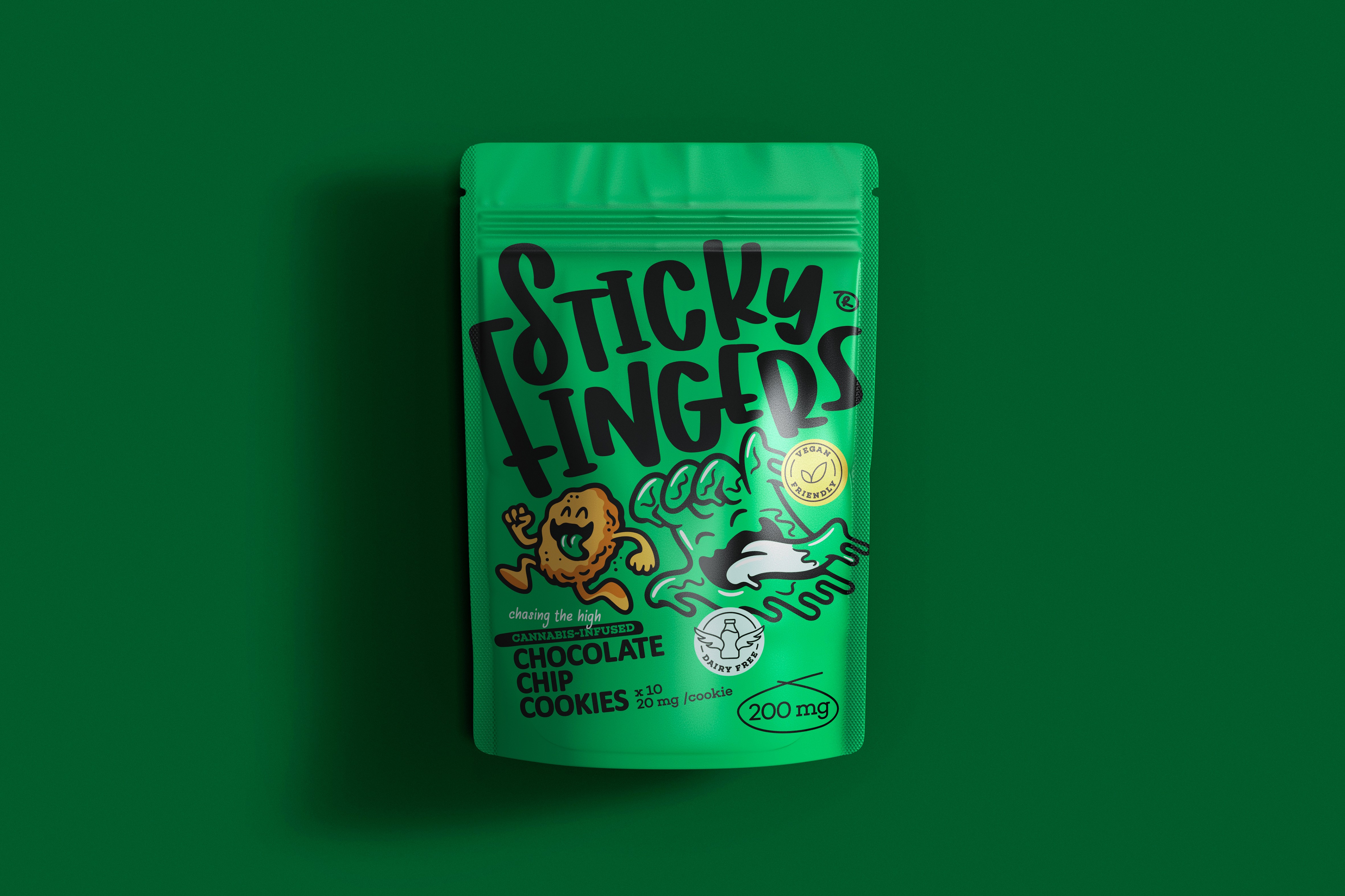
The answer was Sticky Fingers. Developed in close collaboration with renowned illustrator Kris Hewitt, the brand is built around a single, infinitely scalable idea: a hand mascot — fingers outstretched, always in pursuit — forever chasing the high. Witty, adult, and immediately ownable, the mascot forms the foundation of a brand architecture designed to grow with the range. The cookie category chases a cookie. The gummies range chases the gummy. Flavour variants are distinguished by a vibrant colour palette, anchored by a bold, category-owning green. The wordmark — a confident typographic statement — works in full lockup, independently, or as a graphic element across pack.
The result is contemporary, purposeful, and impossible to ignore. Consumer response since launch has confirmed what the design intended: when you trust your audience's intelligence, they show up for it.